The Label Is Not the Artwork: A Common Exhibition Habit to Rethink
A look-before-reading approach to exhibition labels helps you notice form, material, and mood before wall text supplies its own useful perspective.
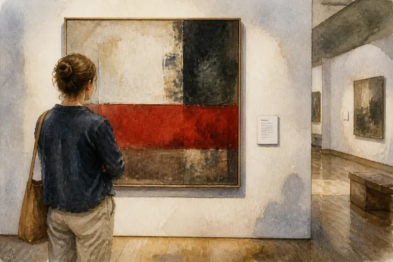
You stop in front of a painted panel, and your eyes go straight to the card beside it. The title, date, medium, and paragraph offer a ready-made route through the work. A look-before-reading approach to exhibition labels takes the opposite order: spend time with what is in front of you, then let the label add information rather than dictate the first impression.
This is not a rule against reading. Exhibition labels can supply an artist’s words, explain a material, or connect an object to a place and a history. The point is to notice what your own attention does before those details arrive. A label is a useful second perspective. It is not the artwork’s user manual.
Look before reading the exhibition label
Choose one work that has caught your attention, or one you would ordinarily pass by. Stand where you can see the whole object or image without blocking anyone. For a large installation, this may mean stepping back; for a small drawing, it may mean moving close enough to see its marks while keeping a comfortable distance.
Give your eyes a moment to adjust. Do not force a profound response. Look for plain, visible facts: where the darkest area sits, whether a shape repeats, how a surface catches light, or where a line stops. A small observation is more useful than a grand interpretation made before you have looked.
Try moving your attention through the work in a few passes:
- Whole: Notice the work’s overall shape, scale, and position in the room.
- Parts: Find a detail, edge, mark, seam, or change in texture.
- Relations: See how one part meets another, or how the work sits beside the wall, floor, or nearby objects.
- Return: Look at the whole again and notice whether that detail changes your sense of it.
This sequence is deliberately simple. It gives attention somewhere to go without requiring you to identify a style or guess what the artist intended. In a gallery, where several objects compete for notice and every wall seems to have a paragraph waiting, a few quiet observations can make the encounter feel more like looking and less like taking a reading assignment.
Describe what you can point to
Before you decide what a work means, make a short description that another visitor could check by looking. “A narrow red band crosses the lower half” is observable. “The band represents anger” is an interpretation. The second may turn out to be interesting, but it arrives with a claim that the object alone may not support.
Use questions that keep you close to the visible evidence. Is the surface smooth or broken? Does the work feel balanced, or does one side seem heavier? Are its edges crisp, worn, cut, or concealed? Does the color change across the surface, or is it more uniform than it first appeared?
You do not need to answer every question. Choose one or two that genuinely arise while you look. If a question has no visible foothold, set it aside for now. That small restraint helps distinguish what the work shows from what you have brought into the room.
Say you are looking at an invented, hypothetical arrangement of three folded metal sheets on a low platform. You notice that the middle sheet leans toward the others and that its edge throws a thin shadow. You could record those details mentally before guessing whether the arrangement suggests shelter, pressure, or movement. The expected result is modest: when you later read that the artist chose the folds to direct light, you will have a particular shadow and angle to compare with that information.
Notice your response without making it a verdict
Once you have described a few visible features, check what they do to your attention. Perhaps a rough surface makes you look more closely; perhaps a repeated shape makes the work feel orderly, or a blank area gives your eye room to rest. These are responses, not verdicts about whether the work is successful.
A response can also be physical or practical. You may find yourself leaning in to inspect a mark, stepping back to see a pattern, or losing track of the work when someone else crosses the sightline. Notice what happened without treating it as a test the artwork has passed or failed. The conditions of the room affect looking, too.
If the work leaves you cold, that is still information about your encounter, though it does not settle what the work can do for someone else. Ask what you actually looked at and what you may have overlooked. You can stay unconvinced while remaining curious. Galleries do not issue grades for enthusiasm.
Read the label as a second perspective
Now turn to the wall text. Start with the basic facts if they are useful: artist, title, medium, and any date or location included. Then read the longer text at a pace that lets you separate description from interpretation. A statement about materials may clarify what you are seeing; a claim about meaning may offer one reading among several.
As you read, look for details that answer a question you already had. If the label names a process, return to the surface and see whether you can locate its traces. If it explains where a material came from, consider how that changes your understanding of the object’s presence in this room. Information becomes more vivid when it has something specific to attach to.
Also notice what the label does not address. It may explain a work’s subject but say little about its scale, texture, or relation to the objects beside it. That omission is not necessarily a fault. Labels have limited space, and the work has more dimensions than a paragraph can hold.
When a label’s reading differs from yours, resist the urge to pick a winner at once. Ask what evidence supports each view. The text may provide context unavailable from looking alone; your observation may still describe something the text does not mention. You can keep both in view without forcing them into agreement.
Look again and revise only what needs revising
Return to the work after reading. Give it another unhurried look, this time with the label’s information in mind. Check whether you can see the stated material, pattern, or connection. You may notice a detail that was present all along but had not yet become important to you.
Then compare your first observations with your second ones. Some may stay exactly as they were. Others may acquire a new context or require a different description. If the label identifies a surface as patched rather than painted, for instance, you might look again for joins or changes in texture. The new term does not erase what you saw; it gives you another way to inspect it.
You can keep this process quietly in your head, or jot down a few words in a notebook. In a museum app, a note to yourself can be more useful than copying the full label: “shadow at lower edge; maker connects folds to reflected light.” Avoid writing while blocking another visitor’s view or standing in a place where the gallery asks people not to stop.
How should you handle labels that shape the whole room?
What if I read the label by accident?
Nothing has been ruined. Start with one fresh, specific observation that the label did not supply, such as an edge, color shift, or relationship between parts. The point is to make room for direct attention, not to preserve an untouched mind.
Should I read an artist statement differently from a caption?
A caption often gives identifying facts, while an artist statement may describe intentions, materials, or choices. Treat both as information to consider rather than instructions for what you must see. If a claim feels abstract, return to the object and ask what you can actually observe.
What if I cannot identify what I am looking at?
You can still describe shape, surface, color, scale, and placement without naming the object or process. Read the label afterward if identification matters to you, then revisit the feature that prompted the question. Not knowing the noun does not prevent careful looking.
How long should I spend before reading?
Stay long enough to notice more than your first reaction, but do not turn the pause into a timed exercise. A few observations may be enough for a compact work; a complex installation may ask for more looking. Move on when your attention has run its course, not when you have produced a clever interpretation.
Carry the look-before-reading habit to another work
Try the same order with a work that has little or no wall text. First notice the whole, then a detail, then your response; only after that, look for any nearby information that offers context. This makes the habit useful beyond the single object with the most persuasive paragraph.
In a busy exhibition, you do not need to apply the sequence to every work. Choose one or two that invite a closer look, and let the rest remain part of the room’s larger view. The aim is not to slow the gallery to a crawl. It is to keep the label in its proper role: a source of context you can consult, question, and carry back to the work.
The next time an exhibition card catches your eye first, let it wait for a moment. Look at the object, name one thing you can point to, and then read. That small change leaves the label useful without letting it do all the looking for you.