Before the White Cube: How Exhibition Rooms Learned to Step Back
Before the white cube, crowded hangs and decorated rooms shaped how visitors compared art. See how display choices guide attention without becoming neutral.
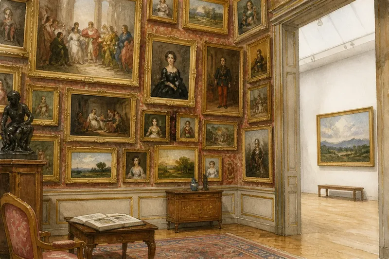
At the Salon in Paris, a visitor could face a wall crowded with framed paintings, stacked in rows from near eye level toward the ceiling. Before the white cube became a familiar gallery ideal, exhibition rooms often asked people to compare many works at once. The shift toward sparse displays was gradual, varied, and tied to changing ideas about how art should be seen.
Salon hangs made the wall a shared field
In European academies and public exhibitions, including the Paris Salon, paintings were often arranged close together, with larger works above smaller ones. This dense arrangement, commonly called a salon hang, used the available wall space to show a substantial number of works. It did not mean that every picture received equal attention: position, scale, subject, and reputation could all affect what viewers noticed.
The arrangement encouraged scanning and comparison. A visitor might move between a large history painting and smaller portraits nearby, rather than treating each work as a separate encounter. Frames, decorative moldings, patterned wallpaper, and furnishings could make the gallery feel continuous with a grand interior.
Salon hangs were not a universal rule for every place or period. Exhibition rooms varied according to their collections, buildings, and purposes. The dense wall is best understood as one influential display convention, not as the single format that all galleries later abandoned.
The move toward sparse hanging had several causes
There was no single moment when galleries switched from crowded walls to open ones. In the nineteenth and twentieth centuries, museums and exhibition organizers adopted different arrangements at different times. The rise of modern art, changes in museum design, and new curatorial approaches all contributed to changing display practices, but no one explanation accounts for every institution.
As some museums began to present individual paintings as autonomous works, wider spacing could reinforce that idea. A painting with open wall around it appeared distinct from its neighbors, and visitors had room to step back. This display choice made focused attention easier, while also giving the institution a way to signal which works deserved emphasis.
Architects and designers also shaped the white gallery. Modernist exhibition spaces often favored restrained surfaces and reduced ornament, though actual galleries differed in color, lighting, and layout. The white cube became influential because it made a particular approach to looking feel natural: attend to one artwork, with the room apparently receding around it.
A white cube is designed, not neutral
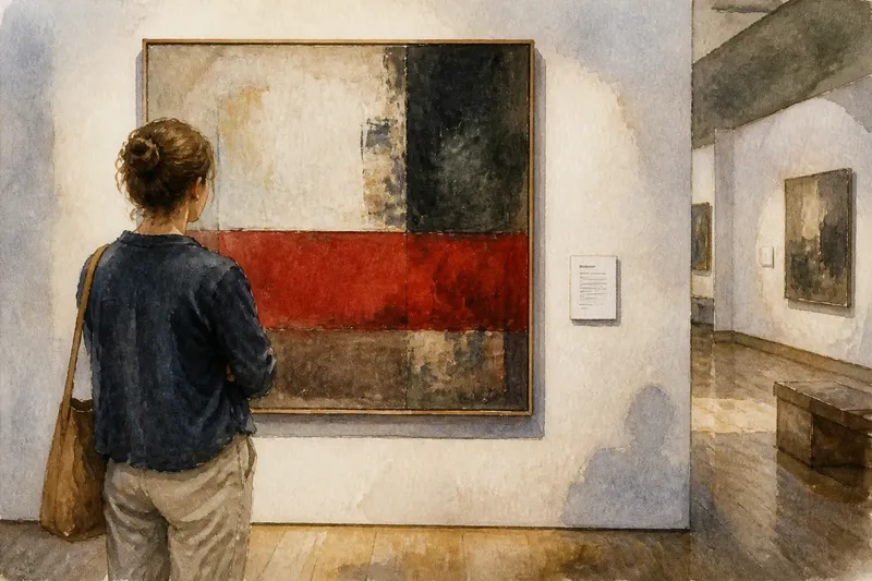
A white cube is more than a white wall. It usually combines plain surfaces, controlled lighting, limited decoration, and enough space to separate artworks visually. Those features reduce some distractions, but they do not remove the choices behind an exhibition.
Lighting, wall color, spacing, labels, benches, and routes through a room all affect what visitors notice. A quiet, evenly lit space can make a painting’s surface easier to inspect. It can also make the gallery feel formal, as though concentrated, solitary looking were the proper response.
Dense and sparse displays produce different opportunities. A salon hang can make comparisons among works immediate; a sparse arrangement can give an individual work more room to command attention. Neither format is automatically more serious, and neither tells visitors what they must think.
Room design changes how a work is encountered
Spacing affects a work’s relation to its neighbors. A painting displayed alone may seem self-contained, while the same painting among close companions can appear part of a larger conversation. Directional light may bring out texture; even light can make details easier to inspect across a surface.
Furniture and circulation matter too. A bench offers a place to pause, while a narrow route may encourage visitors to keep moving. A low ceiling can make a large object feel imposing; a broad wall can give it a measured, quieter presence. These choices shape the conditions of viewing without altering the artwork itself.
Say a curator has a small landscape and a group of portraits, and wants visitors to notice both individual details and relationships among the paintings. If the landscape hangs close to two portraits, viewers may compare their colors and compositions; if it hangs alone above a bench, they may have room to study its distant horizon. The first arrangement supports comparison, while the second favors a slower encounter. Neither outcome is certain, but each is a legible curatorial choice.
What should visitors look for in a gallery room?
Why are some artworks given more space?
Extra space can direct attention, provide room to step back, or accommodate a work’s scale. Look at the neighboring works and the route through the room before deciding what the spacing might be meant to emphasize.
Why do galleries use white walls?
White surfaces can reduce visual competition from the room and separate works from their surroundings. They can also give an exhibition a formal tone, so the color is a choice rather than an absence of choice.
Is a salon hang less serious than a sparse display?
No. A dense hang can encourage comparison and reveal relationships across a collection, while a sparse display can support focused attention. Each makes different connections easier to see.
How can I tell what a room encourages me to do?
Notice the gaps between works, the direction of the light, places to pause, and the route through the space. These details can suggest whether the room favors comparison, close inspection, or continued movement.
Use the room as evidence of curatorial choices
The history of the white cube is not a simple march from clutter to clarity. Exhibition rooms have offered different terms of attention: some put many works into conversation, while others grant each work a quieter stage. On your next visit, notice where your eye lands, what the room makes easy to compare, and what it leaves out of view. Even an empty stretch of wall is part of the exhibition’s argument.